Dyslexic Fonts
In my recent talk “Death to Icon Fonts” I spoke about my dyslexia and more specifically how I use dyslexic fonts to help with my reading.
I can find reading tricky and misread some words. To keep track of where I am I often use my finger or the cursor, and sometimes I need to re-read something a few times to make sure I have read it correctly and taken it all in.
A dyslexic font face helps a lot with this, I find that it reduces the impact of my dyslexia and allows me to read faster, and more accurately.
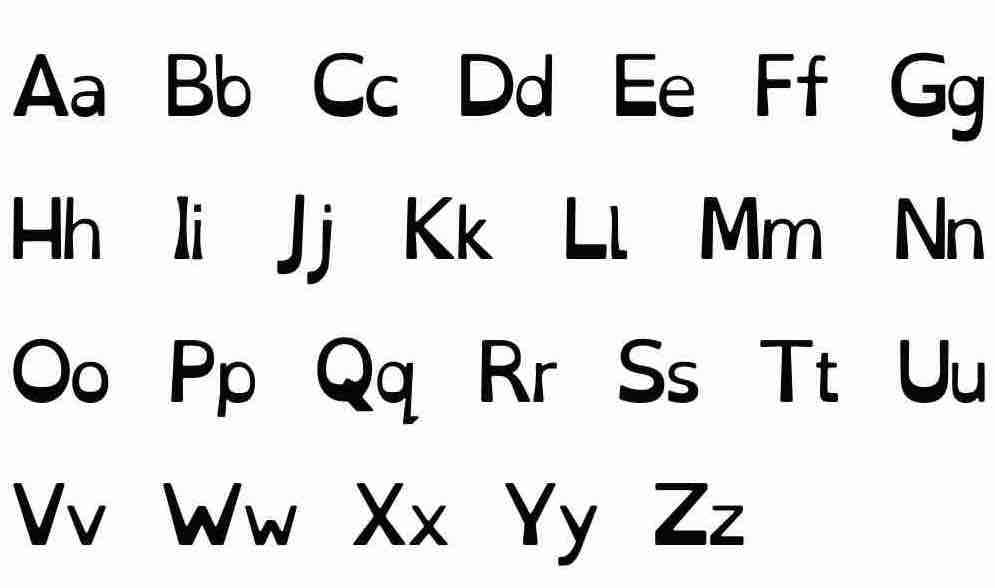
At the moment I am using a font called OpenDyslexic. It’s weighted, so the bottom line is ‘heavier’. This allows me to see which line I am on more clearly and I find they do not blur all into one.


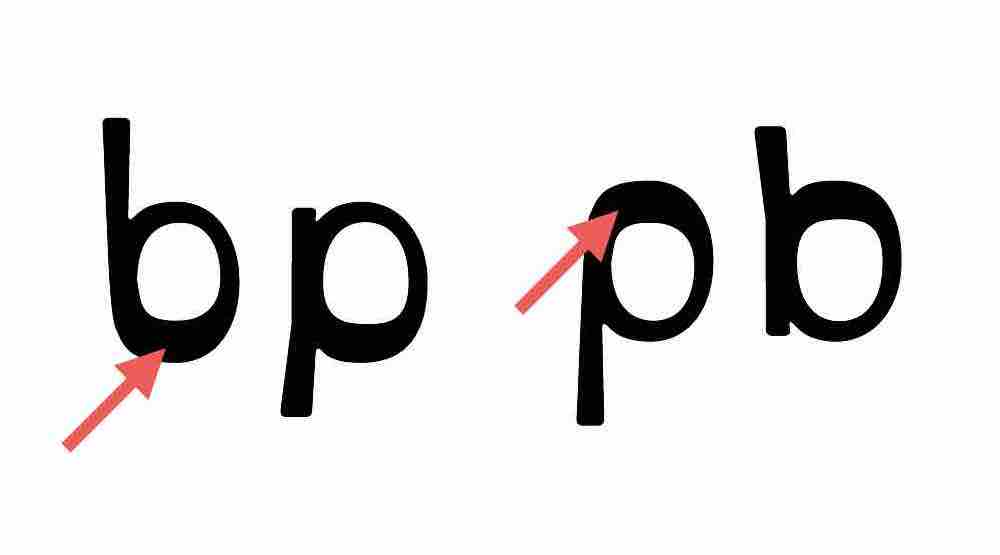
There has been research to suggest that having a base heavy font can prevent users from experiencing letter flipping. This also benefits users who still experience flipping as they can see the heavy section is in the wrong place. Meaning they can work out what the letter is meant to be.
The heavy base also comes in handy for users who get lost in the lines of text. Because the bottom of each line is heavier than the top, it means it’s easier to see where the lines of text start and end.

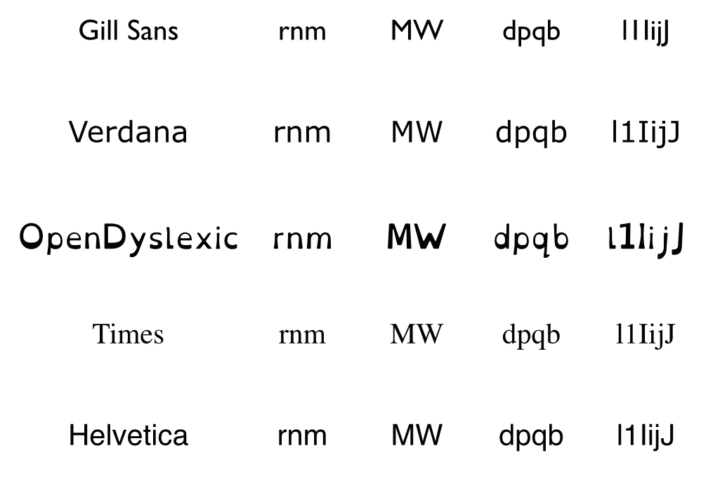
With dyslexic fonts each character is more defined which makes it easier to distinguish similar shaped characters from each other. Gill Sans is particularly unclear when it comes to L, 1 or I in OpenDyslexic each of these characters are clearly L, 1 and I.
Also with Helvetica D, P, D, Q are all the same character just flipped or turned. This means that people who experience letter flipping find it difficult to determine which character they’re meant to be seeing, compared to OpenDyslexic where each character is a lot more defined such as D as a small tail unlike B which means it is clear for the user what they are reading.
Of course there are other fonts designed to help dyslexics such as Dyslexie, Sylexiad and Gill Dyslexic.
Dyslexic fonts aren’t effective for everyone, which is something Neil Milliken has written about. Some people simply don’t like them whereas others can find them unhelpful. They are often portrayed as a solution for all reading difficulties which is not the case.
Sans-serif fonts such as Arial, Verdana, and Comic Sans can work well for dyslexics even though they aren’t specifically designed for them. (The serifs in serif fonts may obscure the shape of a character causing letters to run together and become harder to read.)
People have different preferences and this is important. Let people choose and don’t assume what works for one will work for everyone.